Formed in 1986, The Designers Republic has a vast body of often playful and subversive, imaginative and groundbreaking work in graphic design. Here’s a short video on some of their inspirations and aspirations that pretty nicely encapsulates what they were trying to do:
tDR did a ton of striking designs on flyers, posters, album artwork and logos and then moved on to videogames and more. They are beloved by and inspiring to many, and it’s pretty easy to see why.
We bought Wipeout 3 way back in 2001, and it was one of the first games that really opened our eyes to what game graphics could be. Just take a look at the powerhouse intro:
Seeing that intro was a formative experience for us — it was so mindblowing we immediately reset the PS1 to watch it again! We must have watched it 20 times in a row that first day, and hundreds more since. Those logos for the F7200 racing league and each of the teams are simple, bold, and distinct, and most of all, restrained. That’s a tough combination to create. And the colours are so good! We created a colour scheme in N++ (see screenshot below) called F7200 as an homage to Wipeout 3 and tDR’s wonderful sense of colour.
Each animation in that Wipeout 3 intro is full of personality, identifying differences between each team and bringing life to something you didn’t even know could HAVE life. This is branding at its finest, and it really embellished the world of Wipeout, which could otherwise have been ordinary. That’s a pretty important thing to think about when you’re designing games, especially since it allows you to create some fantastic box art and other related marketing materials as well:
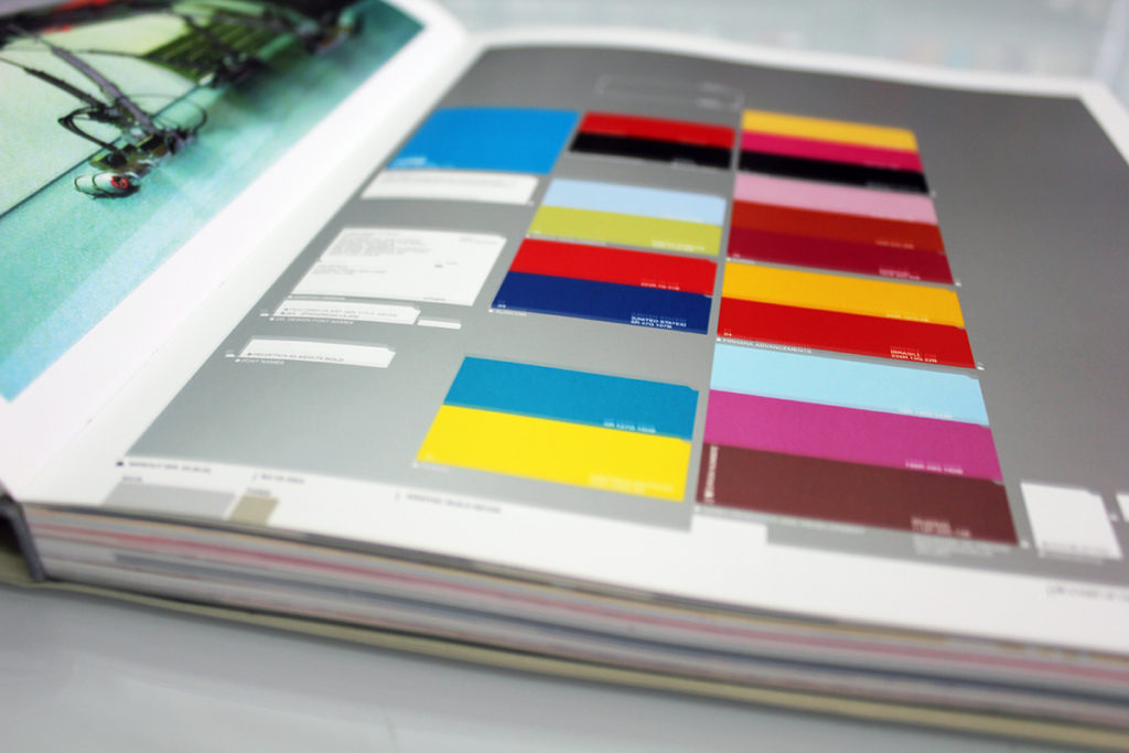
But on to the book! We bought The Designers Republic vs. IDEA Magazine new in 2010, from Aoyama Book Centre in Roppongi (a fantastic store, one you should definitely visit if you’re design-minded and in Tokyo — and while you’re in the neighborhood, go see whatever is being exhibited at Mori Art Museum and 21_21 Design Sight!), and we pore over it frequently. It’s a gorgeous book, a 200-page comprehensive collection of tDR’s most iconic work. It’s a really excellent volume for any fan of graphic design. This special edition seems to have been limited to only 3000 copies, so we were REALLY lucky to find it when we did! Japanese book stores are the best for that: they’re full of hidden gems.
When deciding what we wanted N++ to look like, we certainly looked to the bold, confident shapes and colours tDR were so fond of.

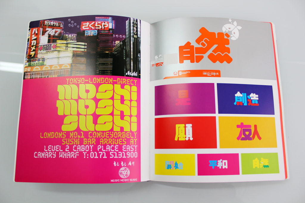
To clarify the aesthetic we were going for, we made a Style Bible, as many designers do, and naturally, The Designers Republic featured heavily. The goal for any Style Bible is to be inspired by the work, to use it as platform on which to build our own creations, to pay homage but never to copy it. We think that inspiration is especially apparent in images like this one:

We really wanted to reference these clean, colourful blocks in our N++ UI:

and we feel we succeeded to a degree (we toned down the colours, obviously, since N++ is so minimal):

Here’s a page that ties into that zeitgeist mentioned last post:

You can certainly see some similarity in themes, shapes and colours, though each group puts its own spin on them.
As we started planning N++ in 2012, we looked into working with Ian Anderson on N++’s concept art — unfortunately it didn’t work out this time, but we’re hoping some day in the future it will. Until then, we’ll always have this amazing book.
///////////////////////////////////////////////////////////////////////////////////////
Author: IDEA Magazine
Publisher: 誠文堂新光社/Seibundo Shinkosha Publishing
This one is a bit harder to get a hold of, and is not currently available at our favourite online bookshop, Abebooks.com, but here’s a list of books featuring work by The Designers Republic that they do have:
HERE
If you have an account at Amazon.co.jp, that might be your best bet for acquiring this wonderful book.


Dear Metanet,
I finally accrued the funds and purchased a PS4. Just in time for the announcement that N++ is coming to Steam.
Oh Well.
What is there to say?
N++ is bliss. You have distilled platforming to a crystal shard and stabbed it through my heart. I am Trotsky’s corpse, witnessing the revolution unfold before me; a technicolor dog day heaven suicide nightmare called enlightenment. Frustration is bliss. Life is just one in a stream. Death is a gift, a way toward definition, purpose in the face of the infinite.
Thank you. Thank you over a decade of joy and anger. Thank you for clean lines, clear goals, a minimalist aesthetic, perfect controls, wonderful physics and a phenomenal soundtrack. N++ fulfills my every want, but keeps asking for more. It’s timeless, but I’m in desperate need of gold.
N, how I have missed thee. And yet, it is like I never left you.
Wow… thank you so much, W. Fry! Comments like this really help keep us going — we’re so glad that you “get” our game, it’s awesome to hear that we managed to hit the mark we were aiming for 🙂
Don’t worry, once the Steam version is out we’ll be releasing lots of new stuff for both PS4 and Steam versions, stay tuned for more info 😉
[…] vector aesthetic we loved so much (as seen in the two previous books we’ve posted here and here), AND to retain the minimalist hallmarks of the […]
Dear Metanet.
As Lead artist on the Fmv for Wip3out and a HUGE fan of all your N games I want to say how chuffed I am to hear you speak so fondly of our intro. I feel compelled to let you know that after twenty years of making games and over 30++ years of playing them – your N games easily rank in my top ten of all time. Pin point dynamics, minimalist style and a perfect soundtrack to boot. High praise from an ex Montrealer;)
I would also like to add that the work of tDR that you so fondly recognise is mostly down to one designer – Michael C Place who together with his wife Nicky (who was the AD on Wip3out and created those animated logos at the end of our intro) have long since formed their own design company called “Build” in Leeds.
Look em up and tell them PBN sent you!
All best!