Wondering what inspired some of the colour schemes in N++, why we added colour at all, or how to add colour to your own game? We aim to help answer all of that in this series of posts, Introducing: Colour.
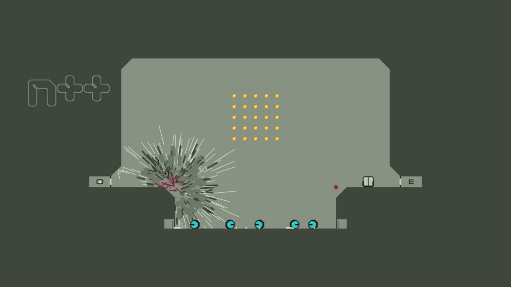
This is Vasquez, the first colour scheme that we felt really worked. It is similar to the colours of N and N+, but with a greenish, military hue (referenced in the name – think Vasquez from Aliens) and some bright, beautiful pinks and purples.
It’s kind of symbolically interesting, as well – at the beginning of this project, we knew we needed to update the look and really wanted to work with colour but were very skeptical it wouldn’t ruin the game or feel gimmicky. Vasquez is a departure from what we were used to, but not a big or scary one – however, the bright pinks let us dip a metaphorical toe into the waters of change. Turns out that water was the perfect temperature. Or something. Anyway this tiny change paved the way for some radical new ideas and experiments with colour, which spread to other areas of development – and that open-mindedness has ultimately made N++ much, much better! And so much more interesting.
So we ultimately learned that change-water can seem challenging and daunting and terrifying, but sometimes that’s all the more reason to dive right in.
ok that’s probably enough with the water metaphor 😉
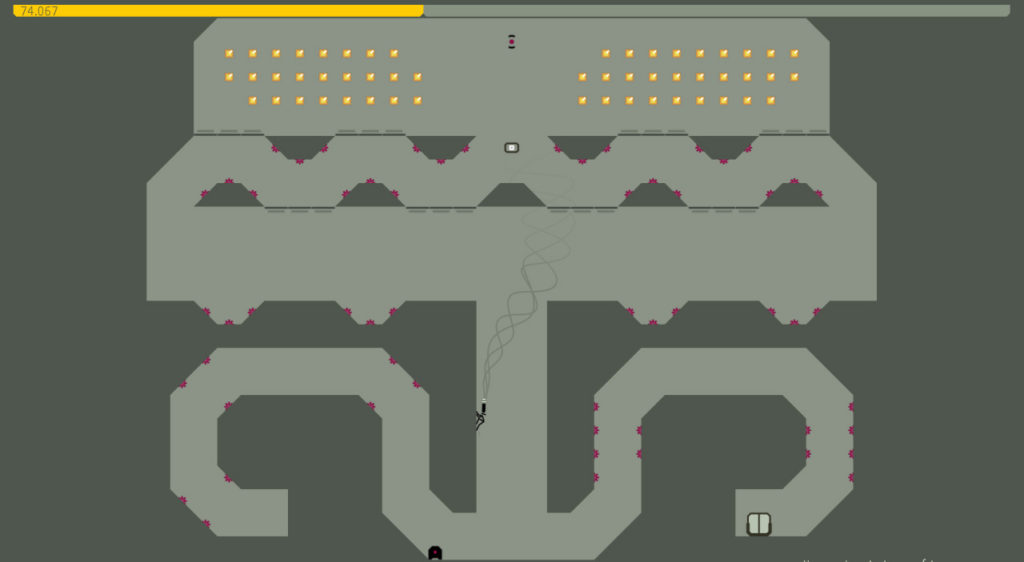
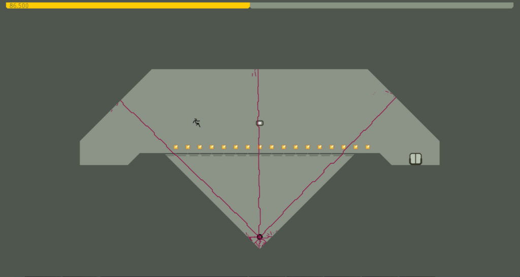
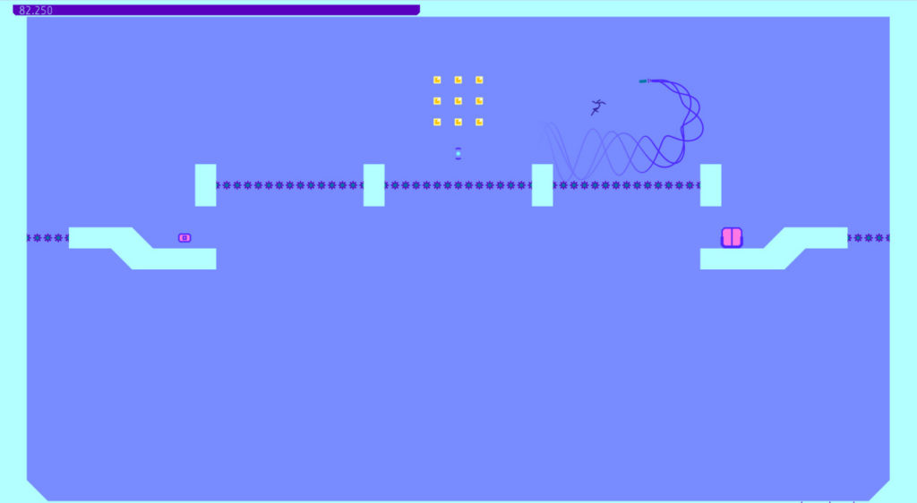
This week we check out Mono, a conceptual monochromatic colour scheme. Why conceptual? It’s all because of the visual language of the game – this skin doesn’t exactly conform to the rules we’ve set up so far. Let’s break that down.
N++ is designed to be a one-screen game, where every level takes up one screen only, with no scrolling or zooming or paging. This lets you as a player plan your route without having to take leaps of faith – jumps where you can’t see the place you’ll hopefully be landing. This happens a lot in other platformers (no judgement), but because N++ is so precise and fast-paced, if you die from an offscreen enemy or pit you couldn’t see, the game would feel punishingly unfair. N++ already walks a narrow line between frustrating and satisfying, and it’s easy for small things to disrupt that balance. We’ve tuned the game carefully, specifically watching out for things like that.
Part of planning your route in N++ involves very quickly “reading” the entire screen – because you usually know you’re going to die only a few split seconds before you do, you have only a few moments to revise a failed plan or improvise a new solution. It’s crucial that you know exactly what thing on screen does what, whether it will kill you to touch it or not, and how to get out of its way. So when designing graphics, we generally want to keep things similar across colour schemes – shapes and colours are of the utmost importance in creating a good user experience.
Throughout many skins, we try to keep colouring consistent: mines are red, zap drones are blue, gold is, well, gold. But in this skin, we threw it all away for a series of escalating grays.
Each enemy, object and effect are drawn in a smooth and silky shade of gray – except for gold and blood, to keep things interesting. Very dramatic!
How can we do that if, as we just explained, that could confuse players and make the game skew frustrating? Fear not, we have a plan: N++ (as the others in the series before it) will feature FUN-lockables ™, one of which will be colour schemes. We’ll only unlock this one after players have been playing for a while, and when they are familiar enough with the shapes of enemies that we can tweak the colours without disrupting their experience. And of course, colours can be changed at any time, so you’ll get to customize your playing experience. Everybody wins!
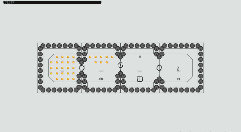
This colour scheme is called Basic, and references the high-contrast colours of early computer terminals that pepper our childhoods. BASIC (and QBasic) was one of the first programming languages each member of the N++ team played around with, and it certainly had an impact on who we are today, and why we decided to make games.
Making games as a creative outlet lets us create worlds and structures and characters and ideas from whatever pops into our imaginations. We filter those ideas through our passions, motivations, idealism and styles, creating something that is an expression of our personalities and beliefs: unique and hopefully interesting – to us, certainly, but ideally to others as well. You might not think about changing the world with games, but everything people do is in response to something, or in support of something. So when we at Metanet make games, we try to help create the world we want to see – which in N++’s case is one full of personal development and skill, and the satisfaction that comes with that, style, nuance, stories which are felt rather than told, and androgynous ninjas 😉
The purple, gold, turquoise and light pink in this skin are anachronistic given the inspiration, but we like to think that if early computer manufacturers had had the ability to support more colours, these would definitely have been in the running.
//////////////////////////////////////////////////////////////////////////////////////////////////////////////
That should give you something to chew on for a bit. Next post, we’ll explore some more colours and inspirations. Stay tuned!
We previously posted these on tumblr, but we’ve gotten so many questions about how the colours were designed in N++ that we decided to repost them here. Enjoy!






Check this out! 😀
https://steamcommunity.com/sharedfiles/filedetails/?id=759992757