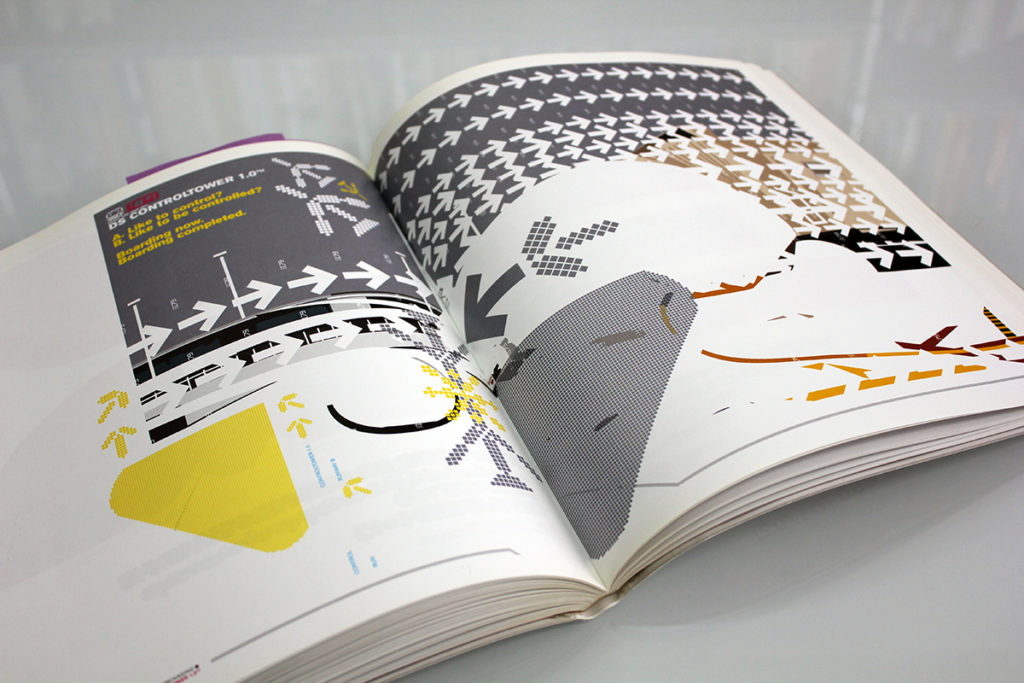
One of the first books we ever purchased was this one, DesignerShock DSOS1. It was published in 2001 by Die Gestalten Verlag, Metanet’s favourite publisher (they have, over the years, published most of our favourite books). We probably bought it brand new, right off the shelf!
We loved the bright, contrasting colours and shapes, and the innovative fonts. We loved the clean simplicity of the vector graphics, both in the form of sharp lines and smooth curves. We could see a lot of immediate graphics potential for games, which the designers of the art in the book had intended — the book came with a cd containing many fonts and assets, and to unlock each font you had to play a corresponding game! We don’t remember actually playing the games, which could mean they weren’t especially memorable, but it’s equally likely that we were just terrible at them 😉
Anyway, the idea of creating a game using the graphics and fonts was fairly cutting edge at the time, as many graphic designers were moving from print to digital and figuring out how to navigate that space. Looking at the book now, it’s clear how much graphic art has changed — this feels very retro, but in a wonderful way we’re nostalgic for since it was some of the earliest vector art we fell in love with. It’s got a cleanliness and modern sensibility we feel still belongs in contemporary games.
Let’s take a look at some example pages:
This book has a lot of possibilities for UI design, which you can see more of in the gallery at the end of the post. Here’s just one style we really like (and hope to incorporate some of the earmarks of in future games):

You can see an homage to this bold, smooth style in N++ — it always been something we’re fond of:

Some of these shapes are reminiscent of N levels and tiles!

Some of the work in this book reminds us of what The Designer’s Republic was doing at the time, which we’ll take a look at in a future post! In any case, it seems there was a zeitgeist several artists were tapping into.

One of the designers behind DesignerShock was Stefan Gandl, who later formed Neubau, going on to achieve considerable success in the graphic design world. Apparently Stefan is very over the style in this book, and thinks it much too dated! Hearing about how other artists feel about their past work — and where they’re going in the future — is always fascinating.
We have all of Neubau’s books as well — we loved their beautiful vector art and commitment to precision and detail, and considered Neubau one of our graphic design heroes. When we decided to make N++, we started out by trying to assemble a dream-team in order to ensure it would be the exemplar of a decade of iteration and refinement, and definitively the best game in the series we could make. So when working on the concept art for N++, we decided to see if we could hire Neubau.
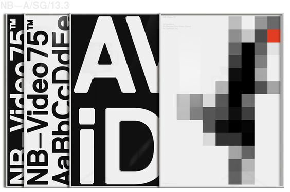
Unfortunately, the concept art they created, although beautiful, was not quite in the direction we wanted to go, so it didn’t work out, but meeting Stefan and his team in Berlin and seeing a little of their process and how they design was incredibly interesting.
Here is the quite aesthetically pleasing font and concept they designed for N++.
We wanted to work with Neubau so much, it was difficult for us to accept at first that their concept just would not work with the game we were making. It was sad to have to move on, but we are still so happy to have been able to take the chance, and meet some of the people who have inspired us so much.
///////////////////////////////////////////////////////////////////////////////////////
Like what you see? Want to know more?
Info about DesignerShock DSOS1 from the publisher: https://shop.gestalten.com/dsos1.html
Buy the book HERE


[…] a page that ties into that zeitgeist mentioned last post: You can certainly see some similarity in themes, shapes and colours, though each group puts its […]